

How to Design a Shopify Product Page That Converts First-Time Visitors
First-time visitors are your hardest customers to convert. They don't know your brand yet. They haven't bought from you before. They have no reason to trust you beyond what they see on the page.
That's why your product page does a lot of heavy lifting. It has to earn trust, communicate value, answer questions, and create enough confidence for someone to hand over their payment details — all in the space of a single page.
Here's what the best-converting Shopify product pages do well.
Lead With Strong Product Images
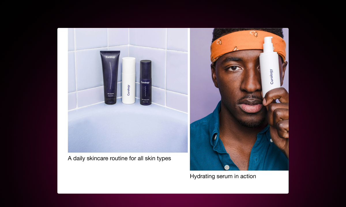
Images do the selling. Before a shopper reads a single word of your product description, they've already formed an impression based on your images.
Use multiple photos. Show the product from different angles. Show it in use. Show scale. For fashion and apparel, show it on different body types if you can.
Image quality matters too. Blurry or small images signal a low-quality store, even if the product itself is excellent. Shoppers who can't clearly see what they're buying are less likely to buy it.
Write a Description That Answers the Real Questions
Most product descriptions list features. The best ones answer the questions shoppers actually have before they buy.
What problem does this solve? What does it feel like to use? How does it compare to what I already have? Will it fit me? What's the quality like?
You don't need to answer all of these in paragraph form. Some can be handled in a short bullet list of key details. But don't stop at specs. Specs tell shoppers what the product is. A good description tells them why they'll be happy they bought it.
Make the Add to Cart Button Obvious
This sounds basic, but a surprising number of Shopify stores bury the Add to Cart button below a wall of content.
The button should be prominent, above the fold on desktop, and easy to find on mobile. Use a color that contrasts with the page. Make sure variant selectors (size, color) are directly above it so the path from "choose your variant" to "add to cart" is one fluid movement.
Show What's Left in Stock
When stock is limited, telling shoppers is a straightforward way to create genuine urgency. A message like "Only 3 left in stock" near the Add to Cart button gives a real reason to act now.
This is different from fake countdown timers or manufactured urgency. Stock messages are honest — they reflect actual inventory. Shoppers respond to that because it's credible.
With Remind Notification, you can add automatic low stock messages to your product pages. You set the threshold (for example, show the message when 5 or fewer items remain), and the message appears automatically when stock hits that level. The message sits near the Add to Cart button where it's most likely to be seen.
Handle Out-of-Stock Variants Gracefully
For products with multiple variants, it's common for certain sizes or colors to sell out while others are available. Don't just grey out the sold-out variants and leave it at that.
Add a "Notify Me When Available" button that appears when a shopper selects a sold-out variant. This gives them a clear next step rather than a dead end. They sign up, you get their email, and they receive an automatic alert when that exact variant is restocked.
This turns an out-of-stock moment from a lost sale into a future sale — and a new email subscriber.
Add Social Proof Near the Decision Point
Reviews and ratings should be near the purchase area, not buried at the bottom of the page. Shoppers look for validation before they buy, especially on their first visit.
Show the average star rating and review count near the product title or near the Add to Cart button. Include a sample of recent reviews further down the page. If you have UGC (photos or videos from real customers), include those too.
For a first-time visitor, seeing that 400 people have bought and reviewed a product is enormously reassuring.
Answer Common Questions Before They Become Objections
Every product has questions shoppers ask before they buy. What's the return policy? How long does shipping take? Does this run true to size? Will this work with my existing setup?
If a shopper has to leave your product page to find the answer, there's a good chance they don't come back. Answer these questions on the page itself. A simple FAQ section works well for this — short questions, direct answers.
Make the Mobile Experience Work Properly
More than half of ecommerce traffic comes from mobile. Your product page needs to work just as well on a phone as it does on a desktop.
Test it yourself. Go through the full experience on your phone: look at the images, read the description, choose a variant, tap the Add to Cart button. Make sure nothing is tiny, overlapping, or awkward to tap.
The Sum of the Parts
No single element makes a product page convert. It's the combination — great images, a strong description, visible stock signals, social proof, and a smooth path to purchase — that adds up to a page that works.
The good news is that most of these changes can be made without a developer and without changing your theme. They're available to any Shopify store, regardless of size or budget.